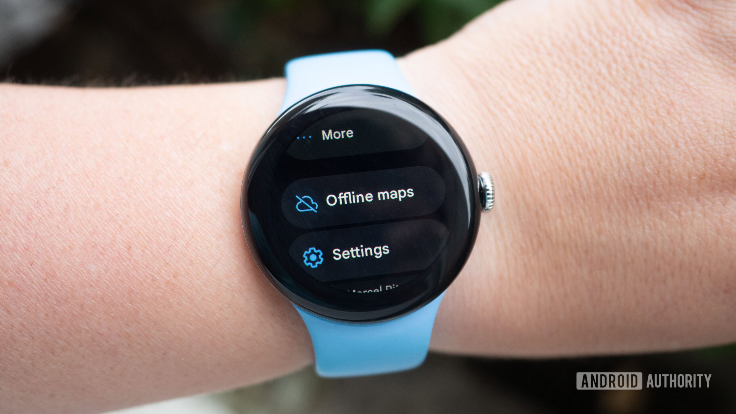
Rita El Khoury / Android Authority
TL;DR
- Google Maps is testing a Material 3 Expressive-style redesign on Wear OS 5.
- The new UI features larger icons and an improved layout.
- The changes have only been rolled out to select users so far.
Google Maps is getting a fresh look on smartwatches, and it’s not waiting for Wear OS 6 to do it. The app is now testing a redesigned interface with some users on Wear OS 5, introducing a bolder, more modern layout in line with Google’s Material 3 Expressive design.
Screenshots and video shared with us by Telegram user Hardik show several UI changes. Captured on a Galaxy Watch 4 running Maps version 25.23.01.766241648.W, the new look features larger icons and layout choices that better suit small circular screens. Frequently used actions like “Home,” “Work,” and “Recents” now appear as colorful modules, while navigation modes are presented as compact pills with clearer icons.
Here’s a video of the wearable in use with the new design elements:
It’s a noticeable departure from the old UI, which leaned heavily on minimalist icons and black menus. Where previous versions often buried options in stacked lists, the updated layout brings everything to the surface with bigger touch targets, echoing similar changes seen recently in redesigned Wear OS versions of Gmail and Keep.
Check out these screenshots of the new UI:
While the Maps redesign doesn’t include the full theming found in the Wear OS 6 developer preview, it still reflects Google’s broader push toward consistency and accessibility across its smartwatch apps.
Compare the images above to how the interface currently looks for most Wear OS Google Maps users, as shown below:
Google hasn’t officially acknowledged the rollout, and not all users are seeing the new layout yet during this testing phase. However, with more core apps starting to follow suit, it’s another sign that Google is laying the groundwork for a more unified visual experience.
RELATED POSTS
View all


